BRANDING
Sève de Santé
Visual Identity for Naturopathy: Branding Design for Sève de Santé
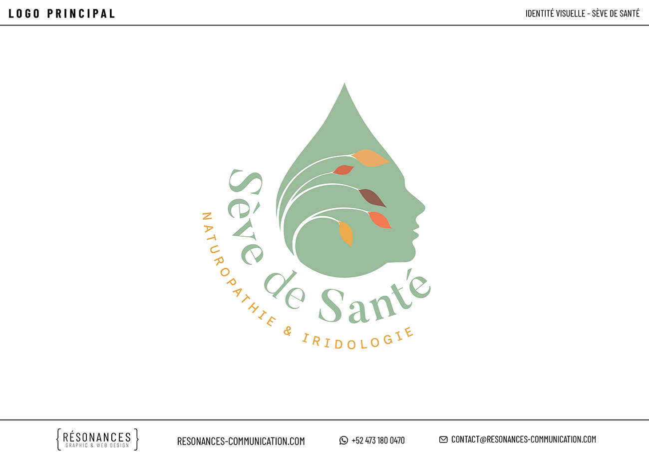
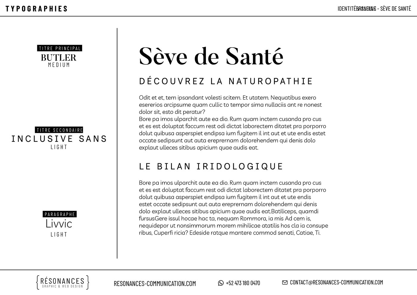
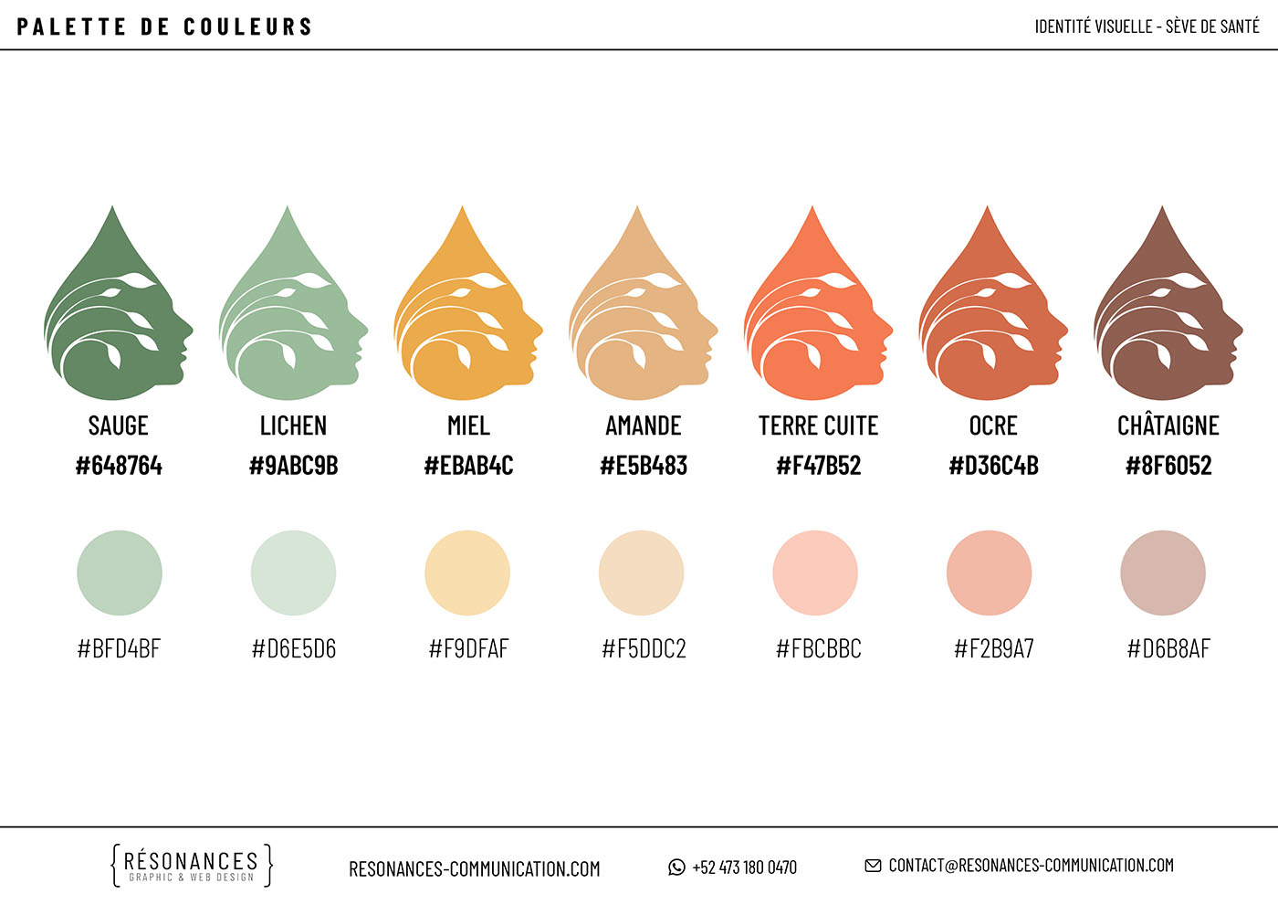
For Sève de Santé (naturopathy & iridology), we developed a complete visual identity, including a primary logo and its variations, typography selection, and a color palette, to create a soft, natural, and instantly recognizable brand image.
Logo and Variations
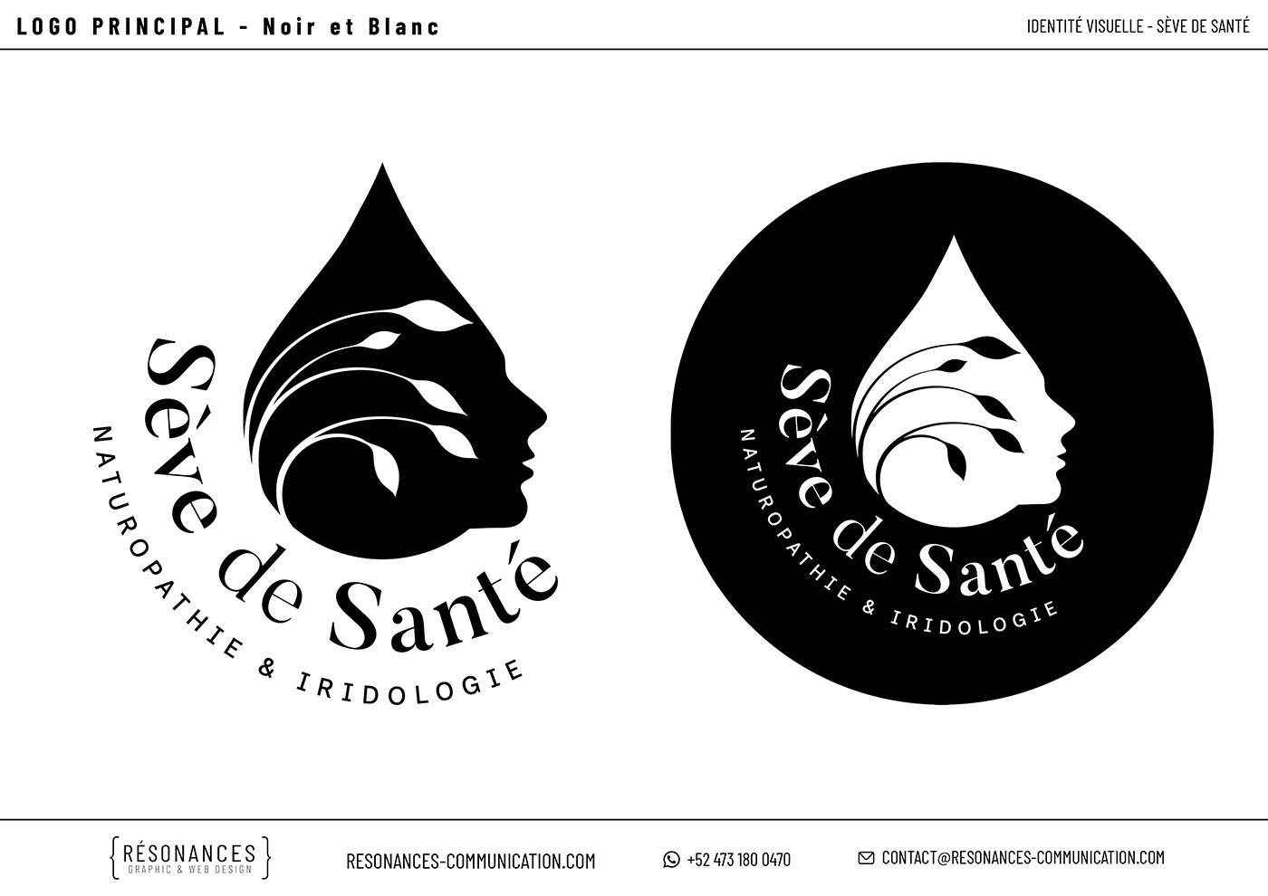
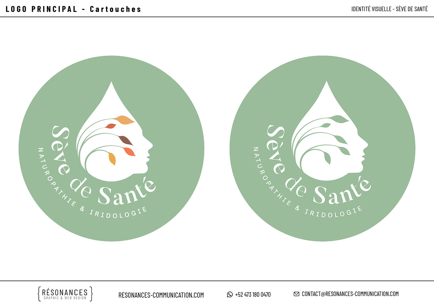
The logo combines a leaf/drop shape with a human profile and botanical details. It was developed in full-color, black-and-white, and various graphic formats to ensure versatility across digital platforms, print materials, and social media.
Typography and Color Palette
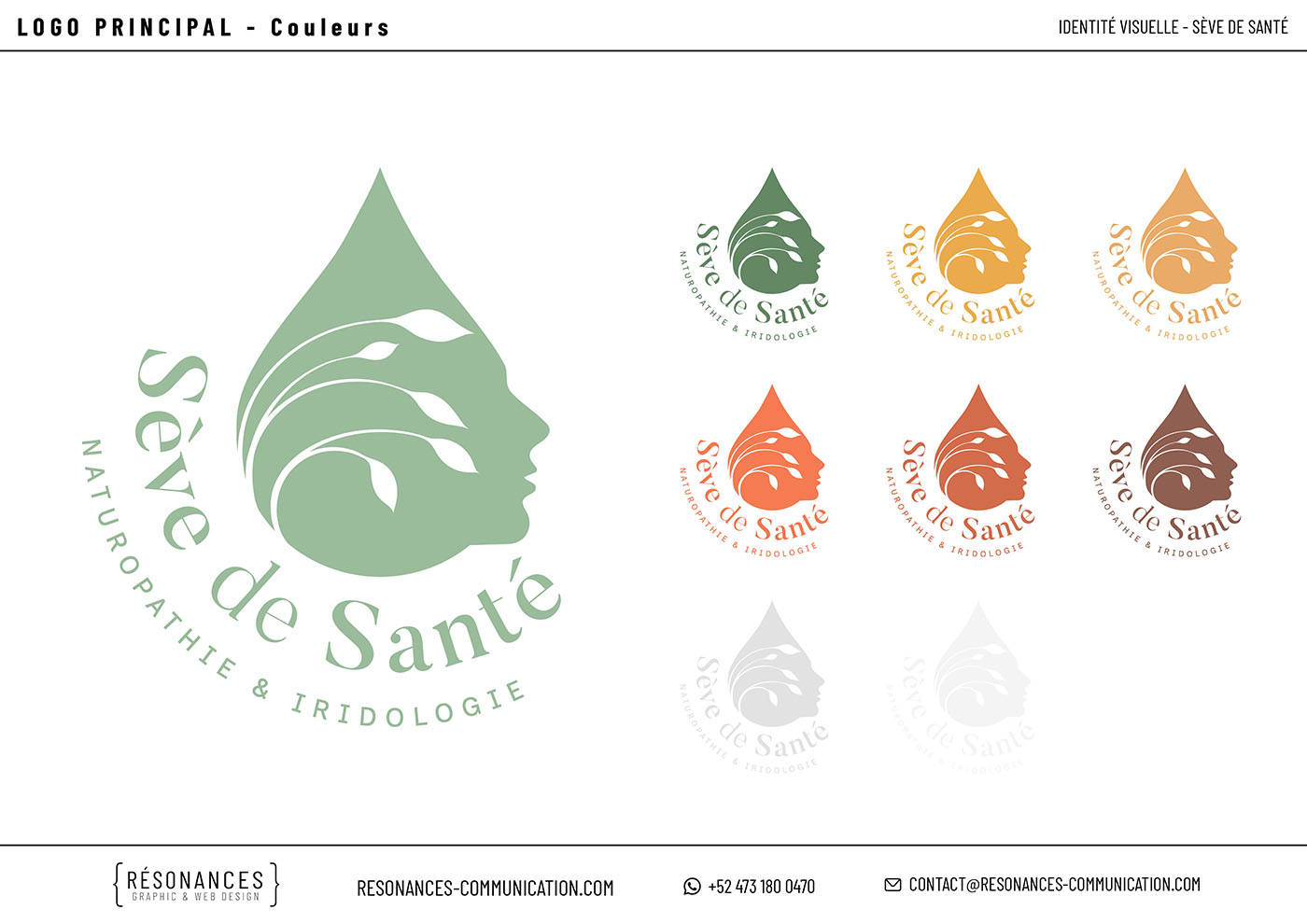
The visual identity is built around a combination of typefaces (Butler, Inclusive Sans, and Livvic) and a palette of natural tones: sage and lichen greens, honey and almond accents, and touches of terracotta, ochre, and chestnut. Together, these elements create a naturopathy brand identity that feels both warm and professional.
Make Your Message Resonate!
Contact us!
FILL OUT THE FORM OR MESSAGE US ON WHATSAPP BY CLICKING THE BUTTON AT THE BOTTOM RIGHT!